Squarespace Website re-design: A Nutritionist’s Studio Intensive Case Study
What happens when you have the website, the copy, the offers and plenty of ideas… but turning all of it into beautifully-designed Squarespace pages is taking approximately foreverrr? Ummm…you outsource it! 😌
Which is what this Studio Intensive Case Study is all about!
first, some background.
Krista found me through Google all the way from California. She’s a Functional Nutritionist supporting adults and children with complex health concerns, with particular expertise in PANS/PANDAS, thyroid and hormone challenges for adults, and gut, skin and immune concerns in children.
On our Discovery Call, Krista said she’d found herself wasting time struggling to turn each webpage into something polished and structured — and decided she would rather hand it to someone experienced with Squarespace website design for nutritionists who could do it much more efficiently and effectively.
Enter: A Studio Intensive. We booked focused time together to transform some priority pages, and create a much more cohesive, intentional site. Adding additional hours onto a Studio Intensive to complete everything on the wishlist. :)
The ‘before version’ of her squarespace site
As you can see, much of the original nutritionist Squarespace website design relied on the same cream background, small typography and fairly simple columns of text, with few visual sections to break things up.
This meant that longer pages could feel a little like reading a Word document online rather than being intentionally designed for the web. There wasn’t enough visual hierarchy, which meant important information could easily blend into the page.
Krista was also struggling with Squarespace’s colour settings.
She knew the existing palette wasn’t quite right — particularly the cream, it wasn’t doing it for her, she leaned way more to a white base, and the overall tone felt too vibrant, especially the raspberry — and she couldn’t figure out how to translate a broader brand palette into Squarespace’s colour themes in a way that created a natural flow from section to section.
Her goals for our Studio Intensive were straightforward:
Beautiful, functional layouts.
And a beautiful, functional colour system to match.
So that was exactly what we set out to create!
The ‘After version’ of Her nutritionist squarespace website!
Ready for your wellness website glow up?
WHAT WE DID:
1 | Restructured the copy so it worked as website copy
Krista came prepared with copy for the new condition-specific pages, but sometimes content that reads perfectly well in a Word or Google Doc (especially that created by AI tools.) doesn’t translate neatly onto a webpage.
I regularly see AI copy creating:
Looooong paragraphs.
Ideas repeated multiple times throughout the page unnecessarily.
Lots and lots of bullet points. AI tools can be particularly enthusiastic about giving you approximately 47 bullet points when five would have done the job. 😆
Important messages getting buried halfway down the page.
So before I started designing, I lightly edited and restructured Krista’s copy where needed.
I condensed information, regrouped ideas, and adjusted hierarchy and thought about which website copy sections would help potential clients move from: “Is this relevant to what I’m experiencing?” to: “I understand how Krista can help.” to: “This feels like the right next step.”
If you’re DIY-ing your website copy and wondering what on earth actually needs to go on each page, I created a guide that walks you through different copy sections you could include across your homepage, About page, services pages & more.
2 | Redesigned her core Squarespace web pages
Our biggest priority was transforming the content Krista already had into strategic, easy-to-navigate web pages.
During our time together, I worked across:
Her Homepage
Her Packages Page
Her PANS/PANDAS page
Paediatric skin and immune health
When I design, rather than simply dropping blocks of copy onto each page, I think about: What needs to stand out? How can we make this content easier to digest? And, importantly: can someone quickly understand who Krista helps, what she helps with, how she works and what they should do next?
That thinking informed the layouts across all the pages.
I kept the design elements she already liked — Krista had been using softly rounded corners throughout the site, so I carried that styling through the new page layouts.
→ Turned the homepage into a clear journey
The information Krista had on her homepage and Packages page didn’t change much— but what did change was how that information was structured and presented.
On the homepage, we created a much stronger hierarchy from the moment someone lands on the page using typography, colours, and borders. Her offerings are now much more visually distinct — instead of three pieces of information blending into the surrounding page, each option now has its own imagery, heading, supporting details and clear next step, all within a clear container. Then, I reordered the sections around to be more in-line with decision-making.
→ Made the PACKAGES PAGE Much more digestible
The original packages/work with me page contained a huuuuge amount of valuable detail. But the issue was that almost all of it was visible at once. Descriptions, inclusions, testing information, who it’s for, how it works, logistics and investment … all of it was asking for attention as someone scrolled down the page. It was overwhelming!
Fun fact: One of the biggest differences between writing a document and writing or designing for the web is that not every piece of information needs to be visible at the same time.
In UX terms, this is called progressive disclosure. In normal-person language? Give people the key information first. Let them open the nitty gritty when they want it.
So I created distinct sections for her — each package now has a clear introduction, relevant imagery, a booking action and expandable accordions for the finer details. That means interested clients can still access everything they need — including what’s included, who the package is for, testing details and investment — without asking every visitor to process all of that information upfront.
→ Designed clear condition-specific pages
Krista works with complex health concerns, which means her condition pages naturally contain a fair amount of educational content. Someone landing on a PANS/PANDAS page, for example, may have been searching for answers for a long time. Again, the focus was making this information feel accessible rather than overwhelming, and giving strong calls to action.
So, on the conditions page, I used a mixture of editorial layouts, cards, imagery, highlighted statements, FAQs and colour blocking to create rhythm through what could otherwise have been a very text-heavy page — again, making it digestible! (Are you seeing a trend here?)
→ One fun design detail was the tumbling parent quotes for the PANS/PANDAS page.
Krista had collected comments reflecting the kinds of questions, fears and frustrations parents experience when something simply doesn’t feel right with their child, and said she would love that section to be displayed creatively.
After having a think, I decided we could make them feel more like all those thoughts tumbling around in a parent’s head. So I created a section where the individual quote cards tumble and move as you scroll through the page. It brings movement and personality into a serious topic while visually communicating that feeling of having question after question and not yet having the answers. She told me I read her mind — which is always a nice message to receive mid-project. 😆
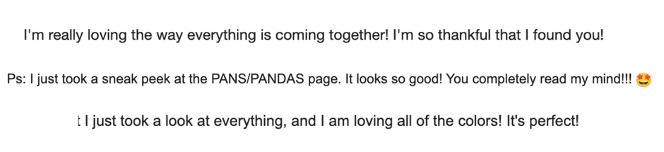
Real time reviews from this super fun nutritionist website redesign
the strategy and thinking behind the (re)designed pages:
The new pages are still content-rich, especially the Packages page, but feel much easier to move through. And that’s pretty important, because a conversion-focused, content-led website isn’t about constantly removing useful information in the name of minimalism (although, yes, some editing is involved, and we want to be very focused with our messaging!) — it’s also about designing that information so people can actually absorb it.
Think about it this way. Just like you optimise digestion so your gut can digest all the nutrients you’re giving it through good nutrition and supplementation — Once you’ve fine-tuned your copy to what really matters — we want the copy that we’ve intentionally shared on our site to be absorbed and digested.
In nutrition terms, you are what you absorb, not just what you eat! The same idea applies to your website. Your marketing is what people actually read, not what you put on the site. So the goals is to make it easy for people to scan and understand it.
3 | Built out a more sophisticated Squarespace website colour palette
This was another biggie. Krista didn’t love the existing cream-heavy palette, and she was struggling to work out how (a) change it and (b) apply colour consistently through Squarespace’s backend.
Squarespace encourages you to build your site around five core palette colours. But Krista’s final colour system needed more range than that.
Her vibe was white background with colourful elements across the page, and vibrant imagery — but the old palette felt TOO vibrant. So together we chose a broader palette (below) just more muted and mature than her previous palette, then I mapped those colours intentionally across Squarespace’s individual section themes.
And I used custom CSS to bring the yellow into elements that couldn’t be controlled through Squarespace’s normal styling options — for the bordered carousel cards used for Krista’s How We Work Together section.
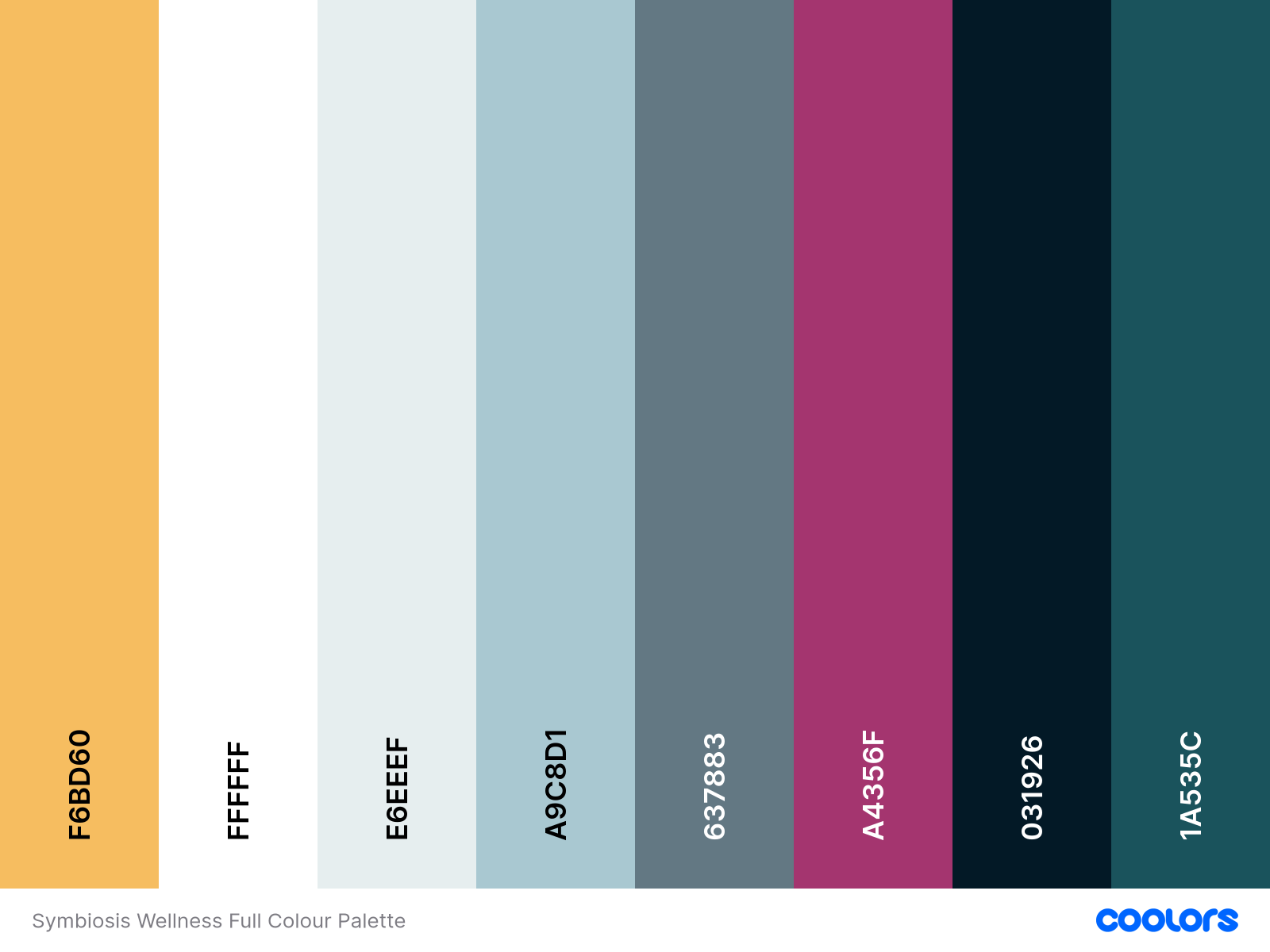
Updated colour palette for functional nutritionist website, Symbiosis Wellness
The colour system we went with goes:
Light sections create breathing room.
Soft blues break up educational content provide a background for CTAs and spotlight certain elements.
Deeper colours blues add contrast and anchor important areas.
Raspberry adds personality and pop.
Yellow gives us a warmer accent we can use sparingly to draw the eye.
Dark teal for footer.
The goal was to turn this collection of gorgeous colours into an actual website design system, with easy-to-use sections that Krista can apply on her site moving forwards, so she can make updates and add sections independently if she wants to. :)
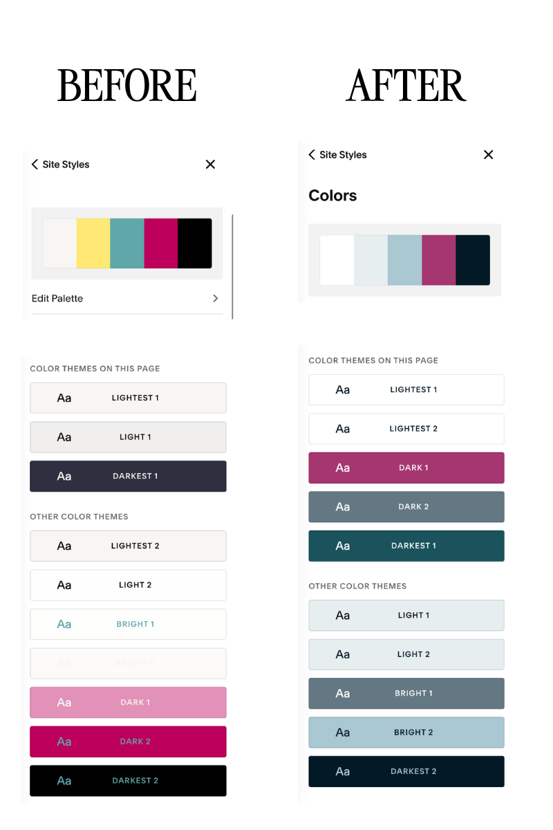
Updated colour system in Squarespace.
4 | Improved typography for website readability
Some of the original heading typography was small and lightweight, so I also adjusted the site’s heading font sizing and styling - keeping the serif style Krista loved.
Because I’m as much of a sucker for beautiful fonts as everyone, but with my copywriting hat on I understand that typography still has to do its actual job: be easy to read. Particularly on a nutritionist website where visitors may be reading longer explanations about complex health conditions, testing and care approaches, readability matters.
I increased heading sizing where needed, strengthened the hierarchy between headings and body copy, and made sure important headlines weren’t disappearing into too-small text.
The end result of this nutritionist’s squarespace website redesign?
By the end of the Studio Intensive, she had:
Professionally designed, conversion-conscious website pages - optimised for laptop, desktop and mobile
A cohesive, expanded colour system built properly into Squarespace
More readable typography with italic accents and stronger visual hierarchy
A website that feels much more reflective of the quality of Krista’s work 🥰
This is what I LOVE about a Studio Intensive. We didn’t need a giant month-long Squarespace website design project. And Krista didn’t need to spend hours wrestling with every individual page herself.
Sure, there is always more to be done of course — SEO & AIO, for example — but when you just want to get some things accomplished in a timely fashion, a Studio Intensive is great.
Why I work across two days for my Studio Intensives
A little behind-the-scenes note on how these projects work. Although I call this a Studio Intensive, I generally spread the work across two focused days rather than trying to cram everything into one gigantic marathon session.
Part of that is personal: I’m an endo girlie, and pacing my energy is one of the ways I practise self-care while running my business as a Squarespace website designer and Copywriter for wellness businesses.
But it also allows me to deliver better outcomes. Creative work requires a surprising amount of brain power. Working across two days gives me space to come back to a page with fresh eyes, notice things I might not have spotted after eight straight hours staring at Squarespace, and make stronger creative decisions.
In this case, the format also worked brilliantly with the time difference. I’m based in Auckland, New Zealand and Krista is on the West Coast of the US, so we had a lovely little international relay happening. I could work through the design from my side of the world, while we still had periods of overlap to review changes, send feedback and make decisions together.
It made the whole project feel incredibly collaborative. And genuinely very fun and enjoyable.
Ready for your wellness website glow-up?
This project is a perfect example of why you don’t necessarily need a full website build to get professional support.
A Studio Intensive gives you focused access to my brain as a Squarespace website designer, copywriter and strategist to tackle those high-priority website jobs with you. That could include redesigning existing pages, building new service or condition pages, refining your colour and typography systems, restructuring copy, implementing new branding, improving your website journey or finally tackling the Squarespace jobs that have been sitting on your list for months.
You bring the wishlist. We’ll prioritise what will make the biggest difference, and what can be achieved in the time available. And I’ll get to work.