Health Coach Website Design Must-Haves to Bring in Clients
Need a client-winning website for your health coaching business?
You’re in the right spot! Explore the website design services »
Newly qualified and stepping into your work as a health coach? Congratulations. Truly. It’s a big step choosing to build a business around helping people feel better in their bodies and their lives.
Or perhaps you’ve been in business for a while now, you’ve worked with some clients, and you’re looking to step up your digital presence.
Whichever camp you’re in, I’m here to help. In this post, I’ll break down some must-haves for your health coach website design if you want it to support your business growth (not just sit there looking pretty).
Table of Contents
Why Does Your Website Matter As A Health Coach?
Your website is often the place people go before they decide to work with you. It houses your offers. It’s often a point of purchase. At the very least, it’s a place of information-gathering and decision-making.
And whether we like it or not, people do make quick judgments.
In fact, research from Stanford found that around 75% of people judge a business’s credibility based on its website design. (Source)
So if your website feels unclear, outdated, or hard to navigate, it can quietly turn people away — even if your health coaching is incredible, and your support could be a huge help for them.
So let’s dive into optimising it with those health coach website design tips.
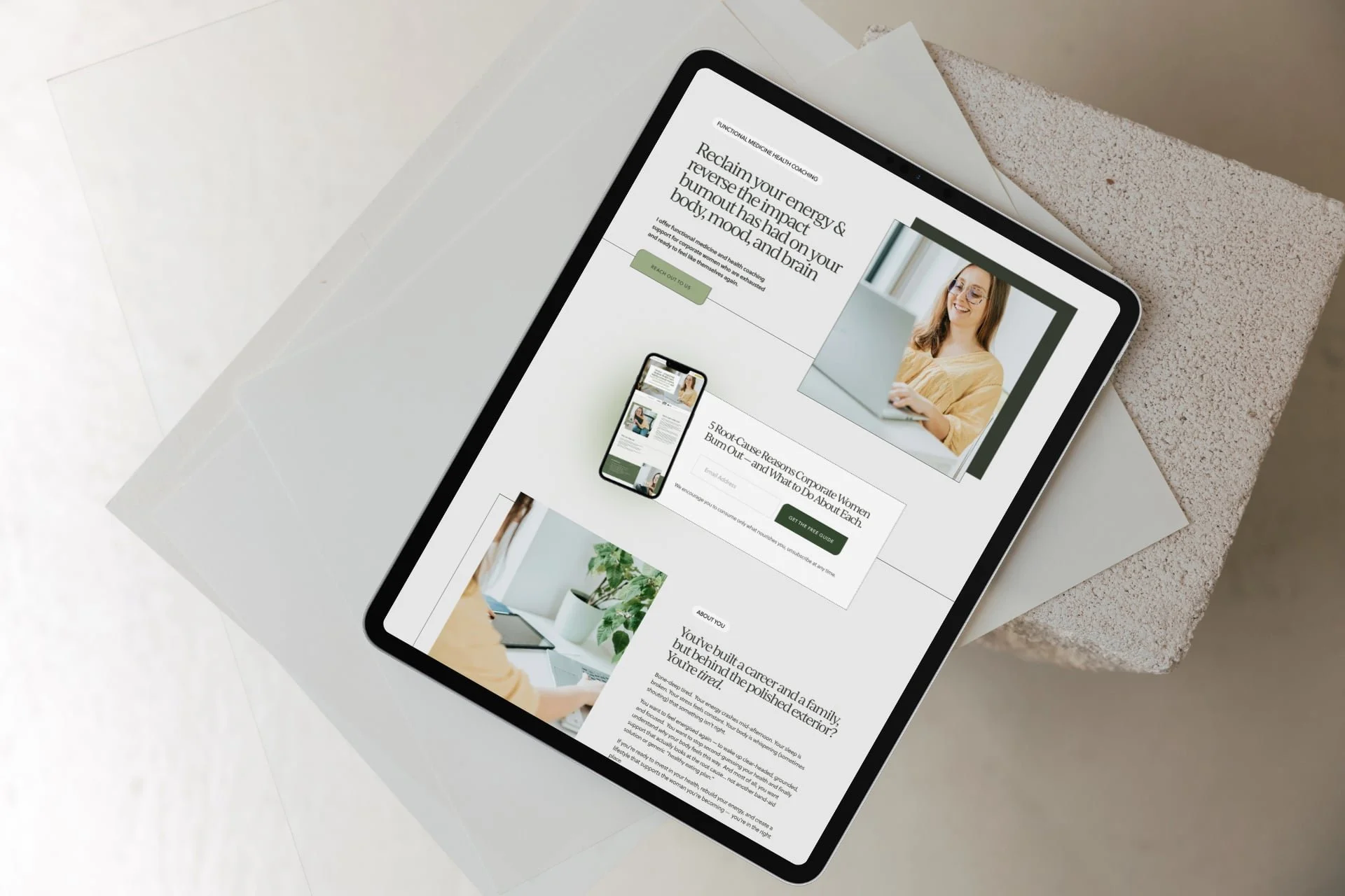
Example health coach website with a clean, green cohesive visual identity
Must-Have 1: A Consistent Visual Identity Across Your Site
Before you build out your site, you’ll need to create (or get a designer to create) a visual identity. One that makes your website feel considered.
That Stanford research paper I referenced above?
It says explicitly that, “We find that people quickly evaluate a site by visual design alone. When designing your site, pay attention to layout, typography, images, consistency issues, and more.”
This doesn’t need to include a logo, graphic designs, monograms and so on.
For a minimalist but effective brand design, curate:
Consistent colours: Your colour palette doesn’t have to be soft or neutral — you can absolutely use bold colours in your health coach website design! — but they should be used in a consistent way across your website. For example, set colours for buttons, text, page sections, accents, and site backgrounds.
Consistent fonts: Two fonts is usually enough. Three at most. One for headings, one for body text, one for eyebrow copy. Use them consistently across every page so your site feels stable and easy to read. You can absolutely use a “fun” heading font, just make sure it’s legible.
Consistent images: Your images should feel like they belong to the same brand. When you get to the website design stage, that means using subtle design treatments like borders or overlays in the website design consistently -but in the initial branding phase, it means having similar lighting, tone, and aesthetic across your site images.
This is why having a photoshoot is so important! Or, investing in high-quality stock images if a photographer is out of the picture. (Pun not intended. 😅) It’s actually a game-changer to level up your website, and either option is well worth the investment.
When all of these visual elements work together, your website feels cohesive and put together. It’s the difference between being styled or looking sloppy. And that matters more than people realise.
A cohesive visual identity (a.k.a. brand identity) helps your health coaching business feel more professional, more established, more trustworthy, more recognisable and definitely recognisable.
Must-Have 2: These Core Pages (& Make Them Helpful)
There are a few non-negotiables when it comes to your website structure. And that’s what pages!
For a wellness service provider like a health coach, these pages work together to help someone go from:
“I’m just browsing” → “I think this could help me” → “I’m ready to reach out”
At a minimum, you want:
A focused homepage. This is where many people will land first, especially if they found you through social media, networking or by a referral/recommendation.
It’s the doorway into your website, and it needs to clearly and concisely communicate: Who you help, What you help with, What services you offer, Who you are, What to do to work with you (book a call, apply) - with CTAs for your other pages. No fluff. No vague statements. In an eye-catching design.A strong services page (or pages). This is where most health coach websites fall short. People want to understand what you offer, what it helps with, what working with you actually looks like, what results they can expect, and how to get started. Include your pricing or package structure — because transparency builds trust.
An About page that feels human and inspiring. Your About page is where people decide if they connect with you as a person and practitioner. It humanises you. This is especially important as a health coach or wellness service provider. On this page, share: your story (briefly, and with purpose - so as it relates to your work), why you do this work, your approach, and your qualifications. It’s not about writing your life story — it’s about selectively sharing what’s relevant to your target market, and in the process, helping them feel like they’re in the right place, and you “get” them.
A blog. Not just an afterthought, a blog can help bring people to your website through search, help potential clients get a feel for how you think and work, help people build trust in your knowledge and expertise before they ever reach out, and support your services by showing how you help.
A booking page that makes it easy to take the next step. For most health coaches, this looks like a brief blurb about what to expect from the call they’re booking and a calendar showing time zones and appointment availability.
OR, if you just want a simple contact page, include an application form to work with you, then have that send a notification email to your personal or work email when someone applies, so you’re aware!
TIP: I recommend choosing scheduling tools that embed booking widgets on your Squarespace website (so they don’t drive traffic away from your site). Below are common session booking platforms for health coaches and what they offer:
Calendly A very pretty and popular scheduling platform with online appointments, embeddable booking widgets, intake forms, payment collection and calendar sync for solo practitioners and clinics.
Acuity: Scheduler with real-time calendar sync with your Google Calendar, appointment reminder automations, and even payment collection. It is not HIPAA-compliant by default, but it can be if you upgrade to the Premium or Enterprise plans and sign a Business Associate Agreement (BAA) with the company.That being said, MANY tools can be integrated with Squarespace, and work for health coaches, you’re not limited to these.
Remember, when you create these pages, write for your client (not your peers)
This is a big one. It’s very easy to fall into language that sounds “professional” or that YOU understand, but doesn’t actually connect or reflect what your ideal clients are thinking, feeling and wanting. (Especially if you’re using A.I.)
But your website isn’t for other practitioners. Or for robots. It’s for the person who is struggling and looking for support. Be selective and intentional with your language - and use your natural speaking writing voice as much as possible.
So instead of saying, “I offer holistic wellbeing coaching”, say something like: “I offer 1:1 coaching to help you feel more energised and in control of your health.”
If you wouldn’t say it in conversation, it’s probably not simple or clear enough.
All these core pages are included in my Squarespace website templates for health coaches & wellness professionals.
Must-Have 3: A Tidy Top Navigation (I Beg You!)
This is a mistake I see again and again in DIY-ed designs. Your top navigation doesn’t need to be complicated. In fact, the more options you give people, the harder it is for them to decide what to click, and the messier and less “profesh” it looks.
Stick to your key pages:
Home (you don’t actually need to include this as a navigation text link, as people can click on your ‘logo’ to go to your homepage).
About
Work With Me / Services - you can have a drop-down here if you have multiple services, or let people click through to a services overview page where they can then click through to individual service pages from there.
Contact or Booking page
If you have other pages beyond these, you can always include extra links in your footer. Your top navigation should guide people toward working with you — not overwhelm them.
Must Have 4: Clean and Clear Page Layouts.
Your website should feel easy to take in. If someone lands on your page and has to work to read or understand it, they’re probably not going to hang around. A clean layout helps people move through your content — and the persuasive process—without friction.
Focus on:
Readable text. Your text colour should make it easy to read at a glance — avoid light grey on white or any low-contrast colour combination. This website is great for checking contrast! Then, use a comfortable body font size, and decent line spacing (aim for 1.5em or so for body text).
Using a clear heading structure. Your headings should guide a visitor through the webpage. Let sizes step down naturally from H1 to H3 or H4.
Short, well-formatted copy. Break your body copy into small sections so they’re easy to scan and digest, and use formatting to draw attention where you want it. Bold phrases help people scan your site and quickly pick up important points. See?
Use consistent spacing across your site. Keep spacing between sections, headings, and text consistent. This is one of the simplest ways to make a site feel more polished. Squarespace (my go-to website builder for health coaches) makes this super doable with its grid layout, section height tool, and site-wide font and line/letter/site margin spacing settings.
Enough white space. Don’t try to fill every gap with content. Space helps your content breathe and makes it easier to read.
Clear section flow. Each section should lead naturally to the next. Avoid jumping between unrelated ideas. (The exception is your homepage, which is often divided into clean, crisp sections. Think of your homepage as a Table of Contents for your key website pages, and your other pages as a (scannable) narrative taking people to an end goal.
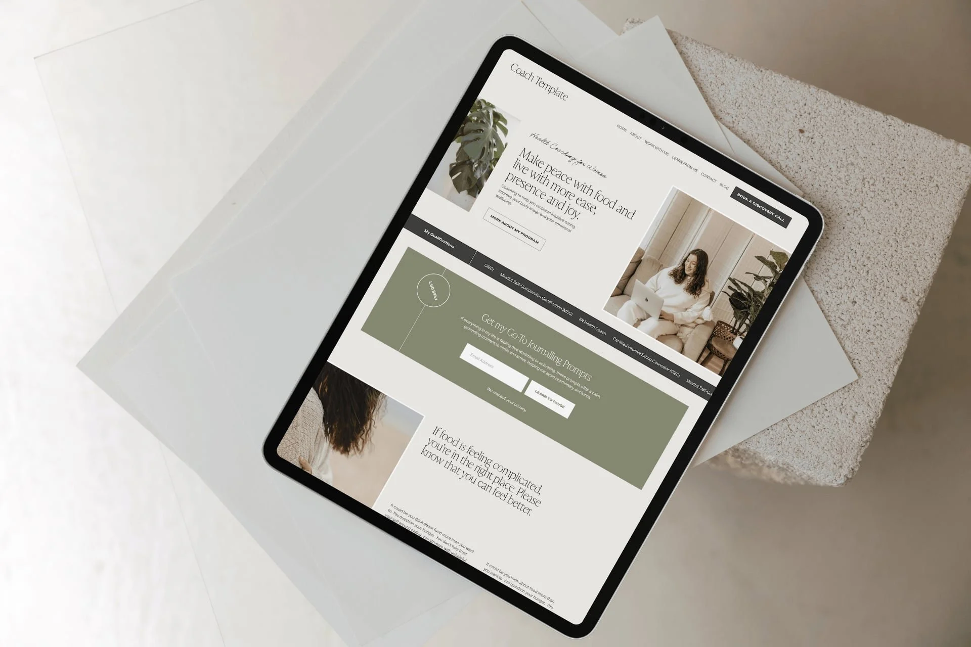
Example lntuitive Eating Health Coach website design with scannable copy, clear layouts and “white space”
Must-Have 5: Strong CTAs
Don’t be shy about telling people what to do next. Your call-to-action buttons matter a LOT. They should stand out enough that someone knows where to click next — and the copy should be clear as day.
For example:
Book a discovery call
Apply for health coaching
Start here
Think about what action you actually want someone to take on each page — and make that easy to see. (And do!)
Must-Have 6: A Lead-Magnet To Entice People To Opt-In
This will help you build your list full of amazing people and prospective clients to nurture, build relationships with, and market to. (And if you give them value or wow them right away, it builds trust).
Offer a lead magnet that either solves a single urgent problem for your ideal client or gives them information they really want, e.g., your pricing or a mini-audio training on creating a realistic inflammation-lowering morning routine.
A benefit of sharing pricing in an opt-in is that you KNOW the people you get joining your list are interested in your work. (Yes, a few may also be your peers signing up to take a peek at your pricing, but that’s no big deal.)
To improve conversions and sign ups, try this as a mini messaging framework 👉
"Download the [magnet name] to [specific benefit] in [time]"
Use clear button text like "Get the [name]" to keep messaging tight
In Squarespace, you can connect many email marketing platforms to your website, including Mailchimp, Kit, and Mailerlite.
Need help setting up your email tech? Book a Day Intensive, or I can do this as part of a full health coach website design project.
You can display your opt-in in several ways in Squarespace. Newsletter box opt-in form (try placing on your homepage and in the footer), marketing pop-up and announcement bar.
Must-Have 7: A Health Coach Website That’s Optimised For SEO
SEO helps the right people find you. You don’t need to do anything overly technical — just be intentional with how your website is set up.
It helps to think about SEO in two parts: on-page (the content and keywords on your website) and technical (how your site is optimised behind the scenes).
On-page SEO:
Start with the basics of deciding which keywords to target (one per page is a good starting point) Use phrases your clients would actually search. For example: “health coach for burnout” “gut health coach [location]” The more specific you can be, the better.
Create separate, keyword-focused pages for your services. This helps Google understand what you offer — and helps the right people land on the right page.
Write blog posts that answer real questions. This is one of the simplest ways to bring people to your site who are already looking for support.
Then, these are some technical pieces that need to be taken care of.
Set your page titles and site (homepage) title properly. Each page should have a clear, keyword-relevant title (not just “Home” or “Services”), but rather ‘Health Coaching for Chronic Fatigue’ or ‘Experienced Health Coach Bristol UK’. Your site title and page titles help search engines understand what your website is about - so your site can be served up in search!
Write your meta descriptions for each page. This is what shows up in search results, along with the page titles we just spoke about. Keep it clear and relevant so someone knows exactly what to expect before they click. Use your target keyword for that page.
Compress your images before uploading into your website. Large images slow your site down, which affects both SEO and user experience. Optimise each image to be under 250KB at best, 500KB at max, before adding it to your site.
Add alt text to your images and make sure that at least one image on each page has your chosen keyword for that page in the alt text. This helps with accessibility and gives search engines more context about your content.
When your website is well optimised for SEO, it can attract people who are already looking for what you offer.
Not sure what keywords to target on your website to bring in traffic?
I offer onsite SEO Strategy - get the details here.
You can also relax knowing that I design all my Squarespace sites to follow SEO best practices listed above.
Must-Have 8: Mobile-Optimised Health Coach Website Design.
This is non-negotiable!
Because chances are, your prospective health coaching clients will be scrolling their phones looking for your support, perhaps clicking over from Instagram or a friend’s WhatsApp message recommending you — not just sitting on their desktop at the office. .
So the last thing we want is a bad experience.
Mobile optimisation means creating a responsive website design that adjusts seamlessly to different screen sizes.
If you’re designing your own health coach website in Squarespace (or any other platform like Showit, Shopify, or Wix) pay attention to the layout, font sizes, and button placements on mobile to ensure that they are user-friendly on smaller screens.
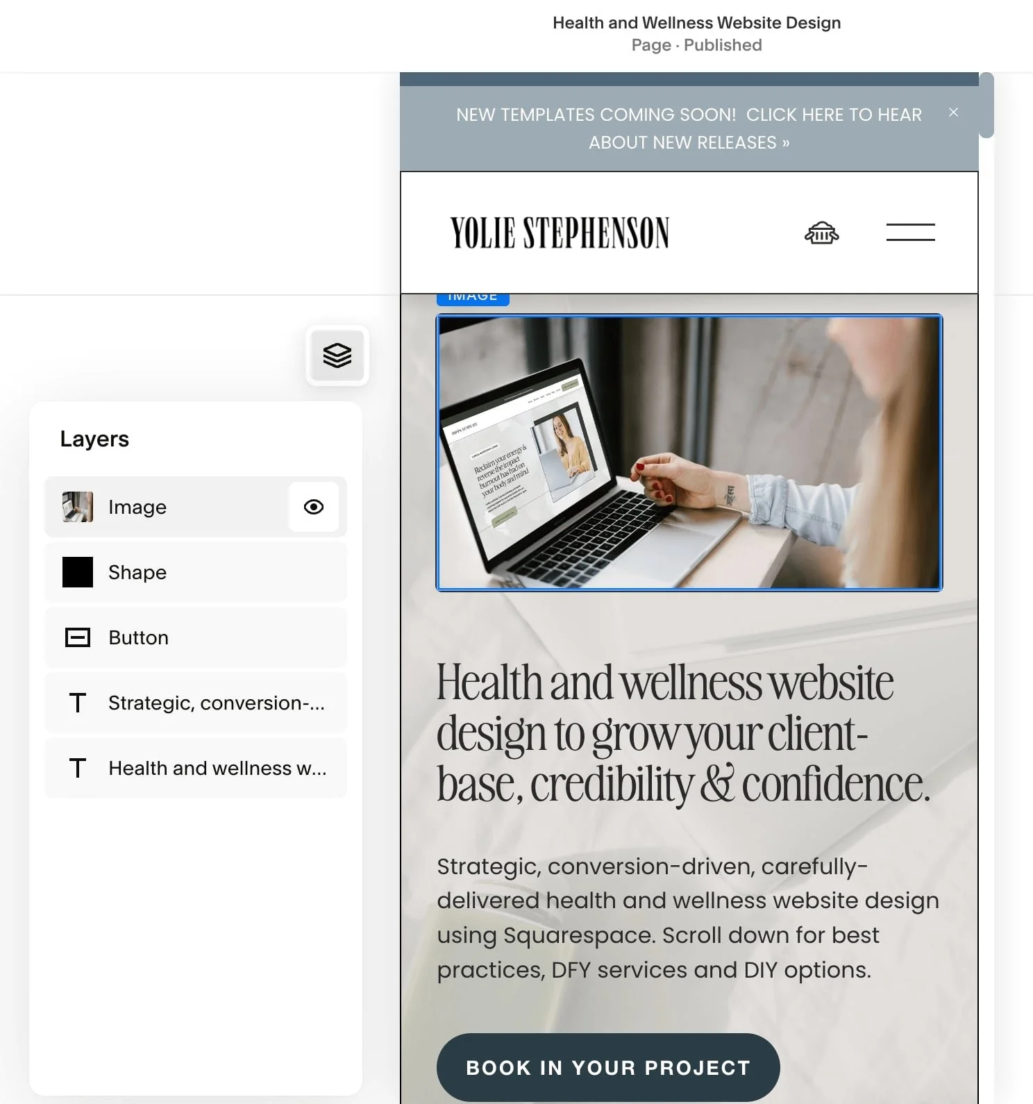
SQUARESPACE SPECIFIC MOBILE OPTIMISATION TIPS:
Squarespace lets you hide certain design elements on mobile, which can be really helpful for keeping designs tight and tidy. The eye (see image above) means that element is displayed on mobile, but you can click on it to switch it off.
Squarespace does love to shuffle mobile designs around after you’ve made changes on the desktop version, so check your website on different devices (phones, tablets, laptops, desktops) to make sure it still looks good or needs tweaking. You’re welcome! 🤭
Why I Recommend Squarespace For Your Health Coach Website Design
I recommend Squarespace (and use it myself) because:
It is easy to use & update your website once it's designed for you (it’s a drag & drop, code-free design – meaning you can make tweaks & add blog posts without hiring help). I provide my clients with training on making updates themselves as part of Squarespace website design services.
Mobile optimisation is easy, so your site looks beautiful on phones, laptops, and desktop computers.
Everything lives under one roof — your website platform, website hosting and domain. You can even buy your domain directly from Squarespace!
It’s affordable and low-maintenance – you pay a single monthly or annual fee (your choice), with nothing to update.
You’ve got the option to build it out with bespoke design elements and functionality created with extra code and plugins. (I love doing this!)
Multi-functional - you can sell 1:1 services, digital courses, online memberships, or digital products on your Squarespace website.
Squarespace offers built-in scheduling software with Acuity, and email marketing with Squarespace Campaigns, for an extra fee. But it also plays nicely with many email marketing platforms, scheduling tools & CRMs (such as Dubsado, Mailerlite, Mailchimp, Flodesk, Calendly, and more)— so you can embed forms, calendars, and opt-ins from each, setting up your site as a functional sales funnel, not just a pretty brochure, with your custom tech stack.
A Quick, Kind Reality Check
Your website doesn’t need to be perfect. Trying to make it perfect is one of the fastest ways to never finish it. It just needs to be clear, supportive, and good enough to start working for you. You can (and will!) refine it as your business grows.
At the end of the day, your website should:
help people understand what you do
make them feel like you “get it” and like you’re “legit”
guide them toward working with you
If it’s doing those things well, it’s doing its job.
All the website design best practices and tips in this post are adhered to in my Laila Squarespace Website Design Template for Health & Wellness Coaches - if you’re looking for a strategic site on a tighter budget.
This template can act as a strategic base, and can be updated with your copy, brand colours and fonts, logo and offers.
Prefer a custom health coach website design built just for you, that’ll work bloomin’ hard for your business?
If you’re just starting out, and you want a website to set you up for success, or if you DIYed your first website and evolved your offers—and the OG version is no longer serving you, I can help!
If your current website feels a bit off — or you’re not getting the inquiries you expected — it might not be your offers are “wrong”. It might just be how your website is communicating them.
I work with health coaches to create websites that feel aligned, easy to navigate, and designed to actually bring in clients and traffic.
If you want more info, check out my Squarespace website design services and Website copywriting, copyediting and SEO strategy.
Next Steps to Show Up Well Let’s create your custom health coach Squarespace website & brand that reflects your vision, passion & expertise.
Fill out the form here and let’s get started.