Day Intensive for a Natural Chef - What I Did to her Squarepace Site in a Day
I met Pit at a Saturday market in Mangawhai! We sparked up a conversation and swapped stories about our businesses. She loved my website, I loved her wholefood nutrition background — and soon after, she reached out for support with her site.
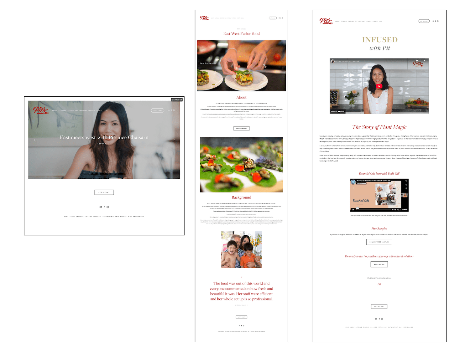
Pit had previously had a Squarespace site built for her brand ‘Pit’s Kitchen’, but her offerings had since shifted in focus, and her business had evolved. It was time for her online presence to catch up.
We met for a coffee in Mount Eden (one of the perks of working with local Auckland and New Zealand wellness professionals = in-person connections! Sometimes, as a WFH girlie, I definitely miss that IRL community —there’s only so much conversation you can have with your dogs).
After hearing her wishlist and website woes, I recommended a Design Intensive to tackle her to-dos.
So that’s exactly what we did over a couple of jam-packed days.
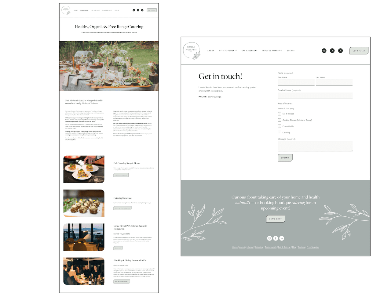
The ‘before version’ of Pit’s Squarespace website
Pit came to me with a clear wish list — but also gave me full freedom as a copywriter, web designer, and marketing strategist to make the site feel more cohesive and conversion-driven.
Here’s what she said she wanted, going into the project:
“I have branched myself out from a chef/caterer to a holistic nutritionist and an educator, so I wanted to amplify my other business on my site. I also wanted to change the look from bold red colour to an earthy tone like green. I wanted to simplify my website for the look (it was very messy), the message, and make it easier to navigate. I wanted to attract my clients/business builders who are into natural health for my Doterra business as well.”
What I did…
Migrated her website from Squarespace 7.0 to 7.1
Pit’s original site was built on Squarespace 7.0. We discussed the benefits of upgrading to 7.1—more design flexibility, better performance, and modern features—and agreed to rebuild the site on the new platform.
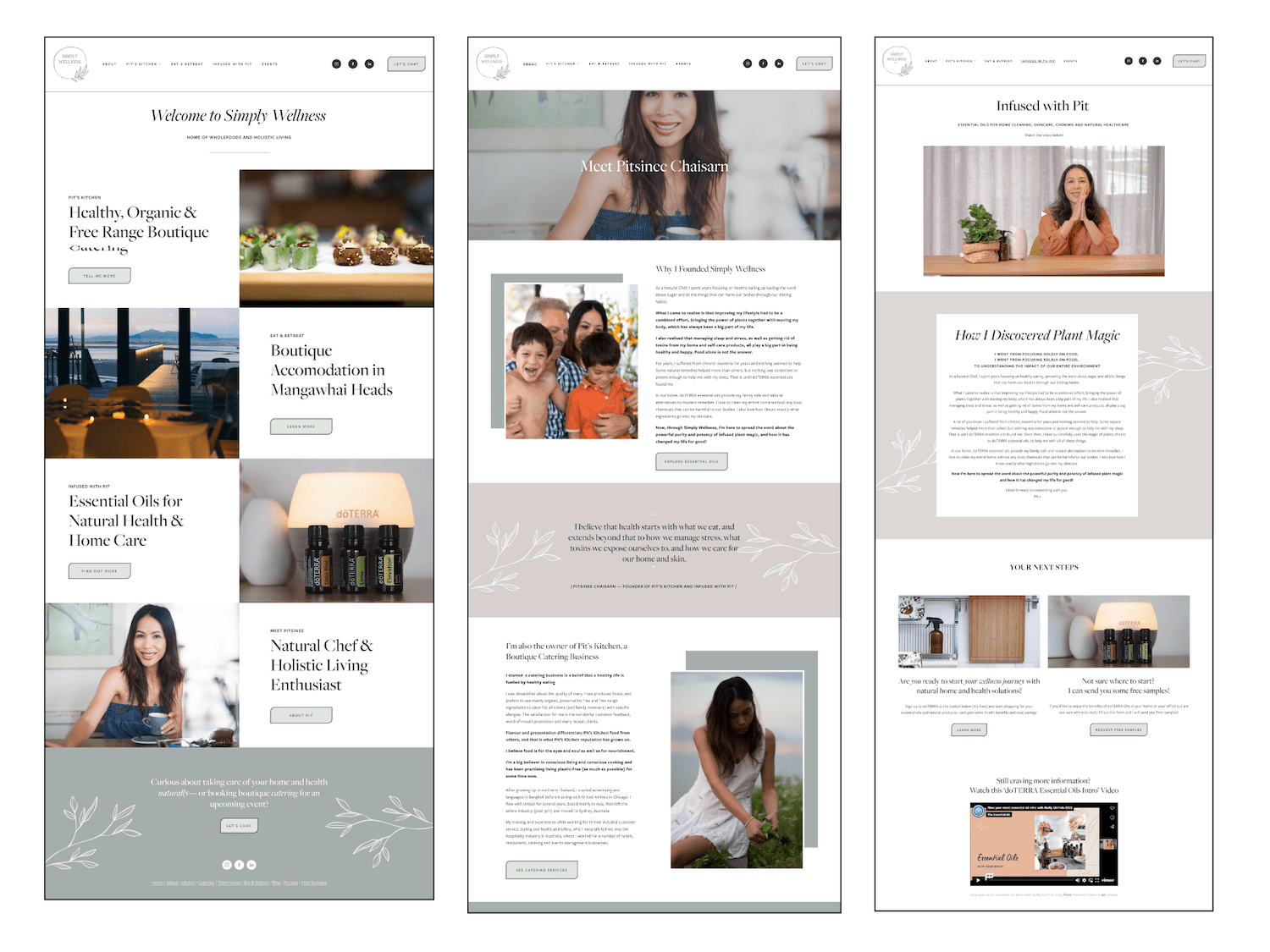
Some legacy elements didn’t carry over (hello OG homepage gallery) but I redesigned the homepage accordingly to offer a more strategic, user-friendly structure.
Restructured copy and pages to reflect her new offer hierarchy
Pit’s primary offering as a Natural Chef is wholefood catering. However, she now also sells and educates around doTERRA essential oils. She wanted to give this a more prominent place on her site. So, I reorganised her content to reflect this new hierarchy.
I also updated the About page to speak to both her offerings under one shared theme: health and wellbeing.
Refined CTAs for clarity and conversion
I reviewed, updated and strengthened the calls to action across the site—making sure they clear, compelling, and reflected her dual offerings.
Created a working Events Page
The events page on the old site was empty. However, Pit regularly hosts catering classes and essential oil workshops. So, I linked up her Humanitix events landing page (where she takes bookings) with her site—set to open in a new tab, so users also stay connected to her Squarespace site while browsing the events on offer.
More strategic top navigation
The old top menu was cluttered and chaotic, making it hard for website visitors to know where to go. I streamlined the navigation to highlight only the most important, conversion-focused pages. Everything else was shifted to the footer to reduce overwhelm and create a cleaner, more intentional user experience. (This is such a common mistake—putting WAY too many links in your top navigation, because you’re not sure what to prioritise.)
Replaced the old logo with her new one
I swapped her original logo for her new version—and used that as the inspiration for her updated design and brand direction.
Designed & set up a new website aesthetic inspired by her new logo
Pit’s new logo introduced a softer, more organic look with earthy, feminine tones—perfect for both the wholefood catering and essential oil sides of her business.
To bring this to life across the website, I:
Created a new colour palette with organic greens and soft neutrals
Used the leaf motif from the logo throughout the site (especially in footers and banners to draw the eye to key areas and important CTAs)
Designed custom leaf-shaped buttons with subtle hover effects using custom CSS for a polished, interactive feel
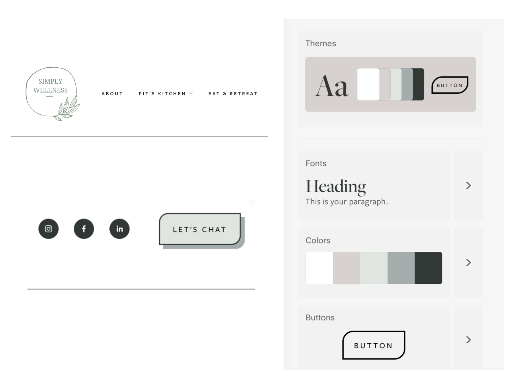
Simply Wellness updated logo in Squarespace, with complementary button design and colour palette
Redesigned web pages for better user experience
Pit’s biggest website woe with her old site was that it felt messy and disorganised—so I updated the page layouts accordingly. No more long pages of centre-aligned copy. Instead, Pit walked away with neat, “tidy” (her words!) web pages laid out for easy scanning and clear, calm communication.
Optimised mobile experience + created a custom mobile menu
Since a lot of people browse websites on mobile, I made sure the design display beautifully on mobile. And I customised the mobile navigation menu — giving the mobile site an elevated feel, and making sure users could navigate her site easily, clearly, with an on-brand experience, right from their phone.
Retired the sliding homepage header (and here’s why)
Her old homepage had a sliding header — which didn’t work on Squarespace 7.1. But, more importantly, it’s not actually best practice for UX. Here’s why.
Research shows that users rarely click through lengthy website sliders. In fact, data suggests that only about 1% of site visitors click on a feature within a carousel, with 84% of those clicks occurring on the first slide. (Source) This suggests that subsequent slides receive significantly less attention, rendering them ineffective for conveying important information. On a homepage…having a slider designed to communicate key information and hook attention can be problematic.
So, I redesigned the homepage to:
Communicate what she does in a single, simple scroll.
Increase time on site, because people can see which service is right for them, and click through accordingly.
Improve clarity around the services she offers, and who the site is for.
The end result of our website intensive:
Of course, if I had an additional day, I could have done even more—such as research and select some target keywords for local SEO and optimise the site for those, add a sidebar to the blog with free opt-ins, create custom Instagram Links page in Squarespace, add the Instagram feed and Flodesk newsletter opt-in, and reviewing all the old images in her site to make sure they are compressed optimally. Those are definitely recommendations I would make. But the end result was great, in the time we had available. It was a big visual transformation for just a couple of day’s work!
What Pit said about the website redesign process:
“I have so much to say but I am scared I'll vomit it out, so I will try to control myself. 😆
I LOVE my new website, I can’t get enough of looking at it.
I wanted to tweak my website for a long time. I heard myself saying to my customers that I was in the process of tidying up my website and made an apology for the look and the mess. I couldn’t bring myself to look at my website, it depressed me! Until I found Yolie.
The process of working with Yolie was a dream. The communication was beyond words, we zoomed and met in person. Yolie listened closely, picked up on my needs, and executed professionally.
Yolie also took care of techy things that I was meant to do myself as the owner, like updating my social media links and transfering my domain from GoDaddy to Squarespace, as well as giving me some guidance on how to layout my pages and use my website strategically to grow my business. It’s also a huge advantage to have a website designer who is a copywriter as well—I am truly grateful that Yolie took time to change around words for me.
I feel like the new website is a true representation of who I am and I am proud to send my website to people without having to apologise all the time for the look and the functionality.I am so happy and thankful that Yolie agreed to take on this project.”
Pitsinee Chaisarn, Simply Wellness & Pit’s Kitchen - Auckland New Zealand
Tired of your messy site? Time for your website tidy up and marketing spring clean?
If you’re a health and wellness practitioner or a well-meaning service provider and your current website no longer reflects who you are, what you offer, your new branding, or the value you bring to your clients—a day working together might be exactly what you need to update it. Whether we met at a local market, we collaborate over a long black in Mount Eden, or we’ve connected online from opposite sides of the world, I would love to support you in marketing your wellness business with a well-wielded website.