What Features Should a Health Coaching Website Include to Attract New Clients?
Your website is often the first place someone goes when they’re considering working with you—whether they found you through search, social, networking, or referral. And the moment they set cursor on your site is an opportunity to cultivate trust and, ideally, gain a new lead, subscriber, client or customer.
Or…it’s a chance to turn them off completely, because your site is unclear, cluttered, or looks unprofessional.
Clearly, your website matters! However, many health coaches and wellness professionals struggle with this part of setting up their business marketing.
Obviously, it’s a topic I love! So that’s exactly what this post is here to help with.
This in-depth post walks you through the key features of a website that actually attracts clients — so you can improve your Health Coach (or Nutritionist/Dietitian) website conversions, or build your site right, right from the get-go. 🙌
Table of Contents
First- what’s a conversion on a website?
A conversion isn’t always a sale. It’s actually any meaningful action that moves someone closer to becoming a client. So while you might not get people to literally become a client on your wesbite, you will get them to move much closer to becoming one.
For a health coach, nutritionist, or dietitian, common conversions include:
Booking a discovery call
Filling out a contact form
Downloading a free guide or checklist
Joining an email list
Booking an appointment
Purchasing a program or package
If someone does any one of those, your website has converted. 🥰 (And you’re well on your way to converting them into a client.)
Now we know that, let’s dive into the features you should have on your site to increase conversions and attract clients.
What features should you include on your Homepage?
Your homepage is very often the first page people see — think of it like the front door to your practice, and your online home. You want to welcome them in with open arms, not be embarrassed to let people into your house. A strong health coach or wellness pro homepage includes the following elements:
A HERO HEADLINE THAT’S CRYSTAL CLEAR & SCROLL-STOPPING
The headline in your hero section - the section at the very top of the page - must clearly communicate what you offer, who it’s for and why it matters…within milliseconds. The hero section CTA that accompanies the headline should be clear and simple to act on. Choose something like: "Book a free 30-minute consult,” "See client results (3-minute read)" or “See the services.”
Use a simple headline formula that is proven to perform well: who you help + outcome you help them achieve + timeframe or an easing phrase (e.g. without [something they don’t want], phrased as a clear promise. Then, follow it up with a CTA.
A couple of examples 👉
Postpartum PT: I help busy mums regain their post-baby body with short, at-home workouts (Please- don’t spend hours punishing yourself at the gym, mama.) [See Services]
Nervous System Regulation Health Coach: Heal your chronic fatigue symptoms in 6 months without spending thousands on expensive supplements. [See Client Results] (3 minute read)
Bonus Tip:Pair your homepage hero headline with a one-line testimonial and a relevant lead magnet just below the fold to capture interest (and emails!) before users scroll further.
LEAD MAGNET PROMOTION & OPT-IN
If you have one, you can offer a free resource on your homepage to encourage email signups.
As just mentioned, placing this right below the header section can be a powerful way to capture interest (and emails) as soon as people visit your site.
Offer lead magnets that solve a single urgent problem for your ideal client. For example, a mini-audio training about creating a stress-free, REALISTIC morning routine, or a pre-marathon packing checklist that gives runners everything they need on race day. This will help build your list for future nurturing and marketing, and means you’re gifting them a hearty dose of value up front, building up trust.
To improve conversions and sign ups, try this as a mini messaging framework 👉
"Download the [magnet name] to [specific benefit] in [time]"
Use clear button text like "Get the [magnet]" to keep messaging tight
In Squarespace, you can connect many email marketing platforms to your website, including Mailchimp, Kit, and Mailerlite. I personally use Flodesk and can embed a code block to share my opt-in box! Need help setting up your email tech? Book a Day Intensive.

A homepage hero section for an intuitive eating coach I found online. An improvement here would be adding a testimonial between the image and the above-the-fold header. This would look pretty, too, in a shape block in Squarespace! I’d also add an image of the guide.
A BRIEF INTRODUCTION TO YOU
Instead of doing a deep-dive into your full background on the homepage, this section should offer a high-level overview of your expertise, your work and your background. You will be sharing more details on your About page. (The About page is where you’ll share your philosophy or approach, your backstory, and your professional bio in more detail, and give people a peek behind the scenes of your business.) Include a CTA on your About Page.
SERVICES OVERVIEW SECTION
Again, this is a high-level overview of who you help and what you do, with a simple CTA to the services. You can pad out this copy a touch, speaking to what they’re struggling with, and painting a picture of their life “after” working together - then invite them to learn more on your services page(s). This section could also include copy that references what you believe (as it relates to your work). e.g. Healing is possible, Symptoms are messages, etc.
Clear CTAs
Always, always, always have clear calls to action for each section, and a path to booking on your Homepage. After all, your website isn’t just there to inform and educate - it also needs to guide people to action! Simple buttons like Book a consultation or Work with me help visitors know what to do next…without pressure.
What features should you include on your Services Page?
After the homepage, your Services (or Work With Me) page is another key page on your site, when paired with your about page.
If you offer a single main service, a single services page works well. If you support multiple areas (e.g., body-positive personal training and intuitive eating coaching, or Somatic Therapy and DBT as a therapist), separate pages can be helpful—especially for SEO.
Your services page should clearly speak to:
YOUR OFFER (WITH BENEFIT-FOCUSED LANGUAGE)
When you introduce the features of your program or package, speak to the benefit of each feature. Why? Outcome-focused and benefit-focused copywriting connects your work — whether it’s therapy, PT, coaching, counselling, or something else — to the real-world changes they want.
WHO YOU WORK WITH
Making it clear who you work with is key to conversions! When someone reads your services page, they should quickly know if they’re in the right place. Be specific about the types of clients you support, what they’re struggling with, what they value, and what they want. (If there’s anyone you want to deter, don’t be afraid to speak to that, too!)

We love a section like this to clarify who your services are for, and call in your ideal client
YOUR PROCESS/”HOW IT WORKS”
Paint a picture of what working together might look like.
YOUR PRICING
Show pricing transparently but strategically. For straightforward services, list a starting price or 2-3 package tiers. Example microcopy could be: "Packages start at $750”, and “Book a 15-minute clarity call if you need help choosing a plan."
BONUS: FAQs in an accordion-style dropdown
This will resolve common objections without overwhelming your readers. Keeping this accordion block near your booking block ensures answers are available in a compact format, and then swiftly move them into scheduling without acres of information to scroll through. In these FAQs, you might talk about things like cancellation terms, whether you can pay with insurance, payment plans, what to do if you need to change an appointment, and so on. A confused or uncertain mind doesn’t buy. How can you put them at ease and clear up any lingering questions?
CTA WITH THE NEXT STEP
Add a booking button and a strong CTA so the next step is obvious. Slot microcopy under buttons (you can do this in Squarespace by setting your p3 font setting to be small) to reassure them, such as "No credit card required" or “No strings attached” for an initial complimentary call.
To give you an idea of how to bring these elements together, you health coaching services page could follow this simple wireframe 👉
Problem statement and paragraph that expands on it
Introduce your solution
Share clear outcomes of how it helps
How it works/what’s included (pricing could come at the end of this section)
Sample results/testimonials
Pricing
Who it’s for/not for
FAQs
CTA
A Booking Page that makes booking easy with a single, streamlined workflow
A booking page may seem simple, but too many options and poor UX can deter people from reaching out. I usually recommend a single, clear booking method integrated into your website, so clients can self-schedule at any time, and you reduce manual admin.
For most health coaches and wellness practitioners, this looks like:
A booking page with a calendar that shows time zones, appointment availability (don’t give too many options), provides instant confirmation, and is followed by a short automated email sequence to reduce no-shows.
A brief note on what happens next or what to expect from the call they’re booking

In this templated Booking Page I’ve also added a suggestion of including urgency on the page to encourage people to book and secure their spot.
Below are common booking platforms for wellness practitioners, and what they offer.
Practice Better: A very robust and popular HIPAA-capable platform with online appointments, embeddable booking widgets, intake forms, payment collection and calendar sync for solo practitioners and clinics.
Acuity + Stripe: Lightweight embeddable scheduler with real-time calendar sync, appointment reminder automations, and payment collection. It is not HIPAA-compliant by default, but it can be if you upgrade to the Premium or Enterprise plans and sign a Business Associate Agreement (BAA) with the company.
I recommend choosing tools that embed booking widgets on your Squarespace website (so they don’t drive traffic away from your site).
To improve conversions, design the booking flow to request only the essentials (don’t overwhelm them with an overly long, complex form). Limit your form fields to 4-6, keep questions sime, and remove any fields not needed for vetting to reduce drop-off, prevent overwhelm, and capture more appointments.
Example workflow:
Clients pick a time and complete a short intake that asks only the essentials (no in-depth personal health questions), like why they’re booking, goals, and preferred contact.
You set up and send instant confirmations and automated reminders (48 hours, 24 hours, and 1 hour before their session) so new clients feel seen, supported, and the next step is clear.
If you want to require a small deposit for Intro Calls, you can; however, this will affect conversion rates. Make sure you include a booking button and map these flows onto your service pages so every CTA opens a predictable, high-converting scheduling path.
Bonus Tip: If you prefer to have people apply to work with you first, so you vet them (then send a calendar link manually, or in a Dubsado automation), you can do that. Instead of a booking calendar, you would use an application form. (Easily created in Squarespace)
If you work with clients in person at a clinic, office, or hired venue, embedding a map on the Booking Page can help them feel oriented before they enquire. (Not to mention, it’s also essential for SEO).
Feature Social Proof & Trust Builders in Strategic Locations on your Site
To consistently turn curiosity into calls, social proof & trust builders should be placed at different points in your site — because different ones impact buying decisions in different ways.
The different types include:
Credentials
Trust-building numbers e.g. number of clients, years in practice, number of qualifications
As seen in logos, if you’ve been featured in national press or TV, or by other entrepreneurs
Testimonials or reviews
Client results (quotes, functional reports, photos)
In-depth case studies
So…where should you put them?
WHERE TO PLACE SOCIAL PROOF AND TRUST BUILDERS FOR MAXIMUM IMPACT
You can lead with professional credentials like an RDN badge, the training you’ve completed, publications you’ve been featured in, or your license number at the top of the webpage to establish clinical credibility. This is because credentials answer early credibility questions, giving people a reason to feel safe, stay on your site, and explore further.
Then, then layer testimonials, Google reviews, press logos and short case studies into the rest of the page to crank up the credibility and trust-building even more. This is because testimonials and case studies carry emotional weight — and emotion is one of the drivers of purchase decisions.
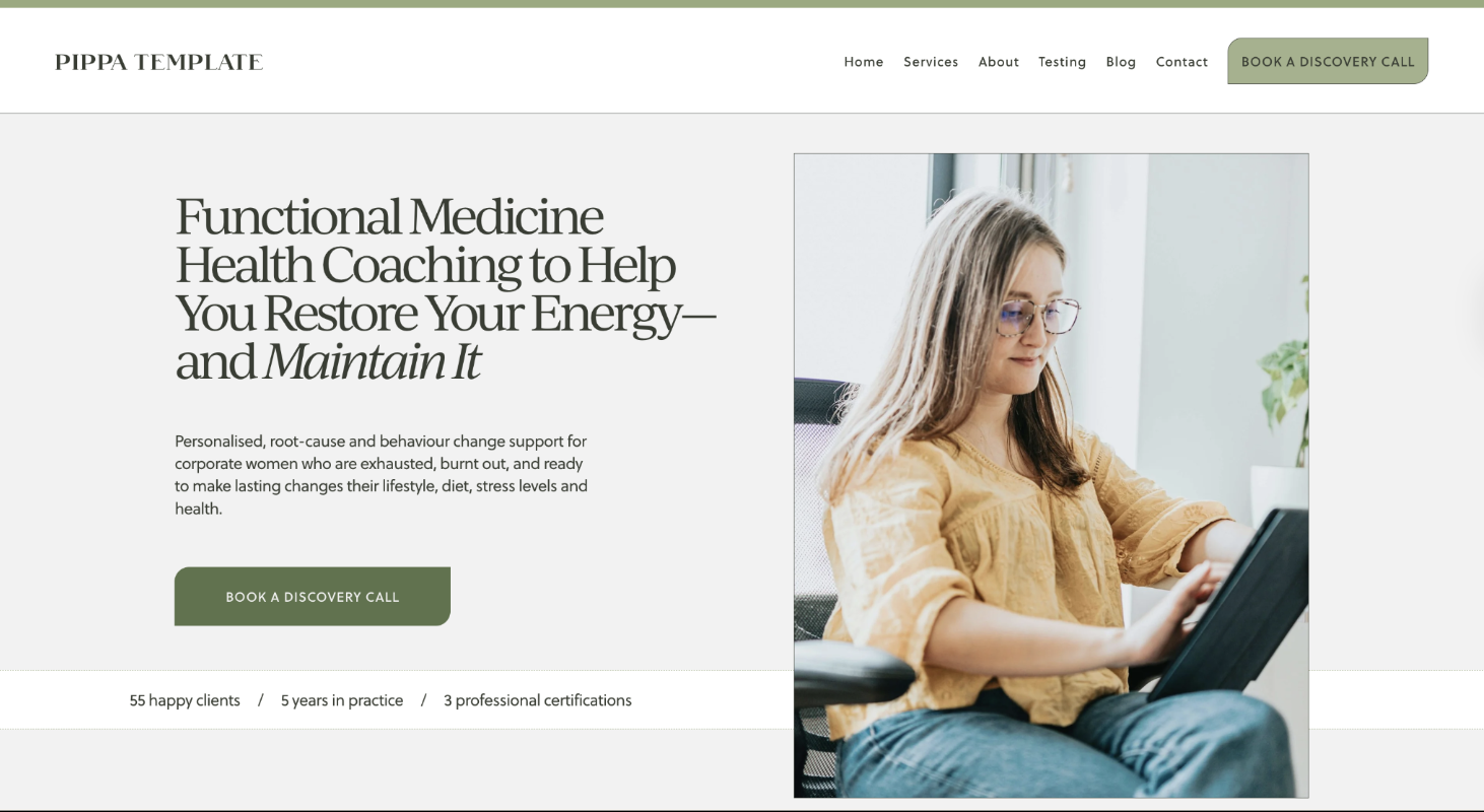
Example of a credibility section placed in the above-the-fold area, as seen in my Pippa Website Template for Functional Medicine Practitioners
RULE OF THUMB:
A good rule of thumb is to place each trust signal/piece of social proof near CTAs so it supports booking, buying, or applying, rather than simply decorating the layout. That strategic placement reduces doubt at key decision points and improves conversion rates.
Reserve long case studies for a success-stories page or for sales pages with higher-ticket offers. Normally, the higher the price, the more you have to convince people!
Bonus Tip:Small layout changes (sharing testimonials and trust-builders strategically) can shift conversions more than a content rewrite alone!
The best part? In Squarespace, you can save sections, or move them up or down a page — so you can easily move your testimonials, trust-builders (and FAQs) to be near CTA buttons. See below!

Use the arrows to move different sections up and down the page in Squarespace 7.1
Some tweaks you can make this week:
Place a strong quote in a Squarespace shape block near your primary CTA on your homepage header, so it stands out (this is called a “call out box”) with a carousel further down the page.
Use the first name and city, where possible, to add credibility without exposing your client’s personal health details. (If they feel comfortable sharing their name.)
Add a visible credential badge near the hero of one of your pages,
Share 1-3 reviews on your booking or application page — to help people cross the line with confidence!
A Mobile-friendly is a Must-Have! (Do the Tap Test)
Once you’ve built your website on a desktop, make sure it works on mobile.
Make CTAs thumb-friendly and easily visible, choose readable font sizes, compress images to speed load times, and check colour contrast for accessibility.
Try this tap test: open your homepage, hold your phone as a client would, and tap every CTA, noting any that are too small or too close together.
You’ll be relieved to know that Squarespace makes it easy to build a mobile version of your website.
A Purposeful Blog Written for Traffic, Trust & Conversions
I know, I know, blogging isn’t everyone’s favourite task. Mine neither. But it can be a powerful marketing tool. A blog helps improve visibility on Google, answer common client questions, share your philosophy and approach, and build trust, confidence, and the conviction that you’re the practitioner for them.
Want to write helpful, connection-and-conversion-focused blog topics?
BLOG POSTS TYPICALLY FALL INTO FOUR CONTENT CATEGORIES
Informational blog posts are education-focused. They build trust, authority, and organic traffic when crafted with SEO keywords in mind. These are supportive posts that clients can read and action. An example would be: 5 Meals & Snacks that Balance your Blood Sugar (& Why This Matters for Stress)
Navigational blog posts help people find you specifically when they’re already aware of your brand, demystify your work, help them understand why you’re the practitioner for them, and make the first step feel safer. An example would be: What to expect from your first nutrition appointment with [Therapist Name]
Comparison blog posts support decision-making and reduce hesitation. Such as, “Health Coach vs Dietitian: Which support is right for you?, or “1:1 Nutrition Coaching vs Online Programs: Pros, cons & who each is best for”.
Finally, purchase-focused blog posts focus more on soft-selling services, with strong calls to action. Examples include a client case study.
For most health & nutrition businesses, a balanced blog schedule would look like 60–70% informational, 10–15% navigational, 10–15% comparison, 10–15% purchase-focused.
Bonus Tip: Over time, blogging can reduce the pressure to constantly market on socials, by bringing people into your site from search.
AND, every single time you post a blog, repurpose that content for social media and your email list. Your blog isn’t written once and then disappears - you promote it, you share it and repurpose it, so it helps you create content quicker next time.
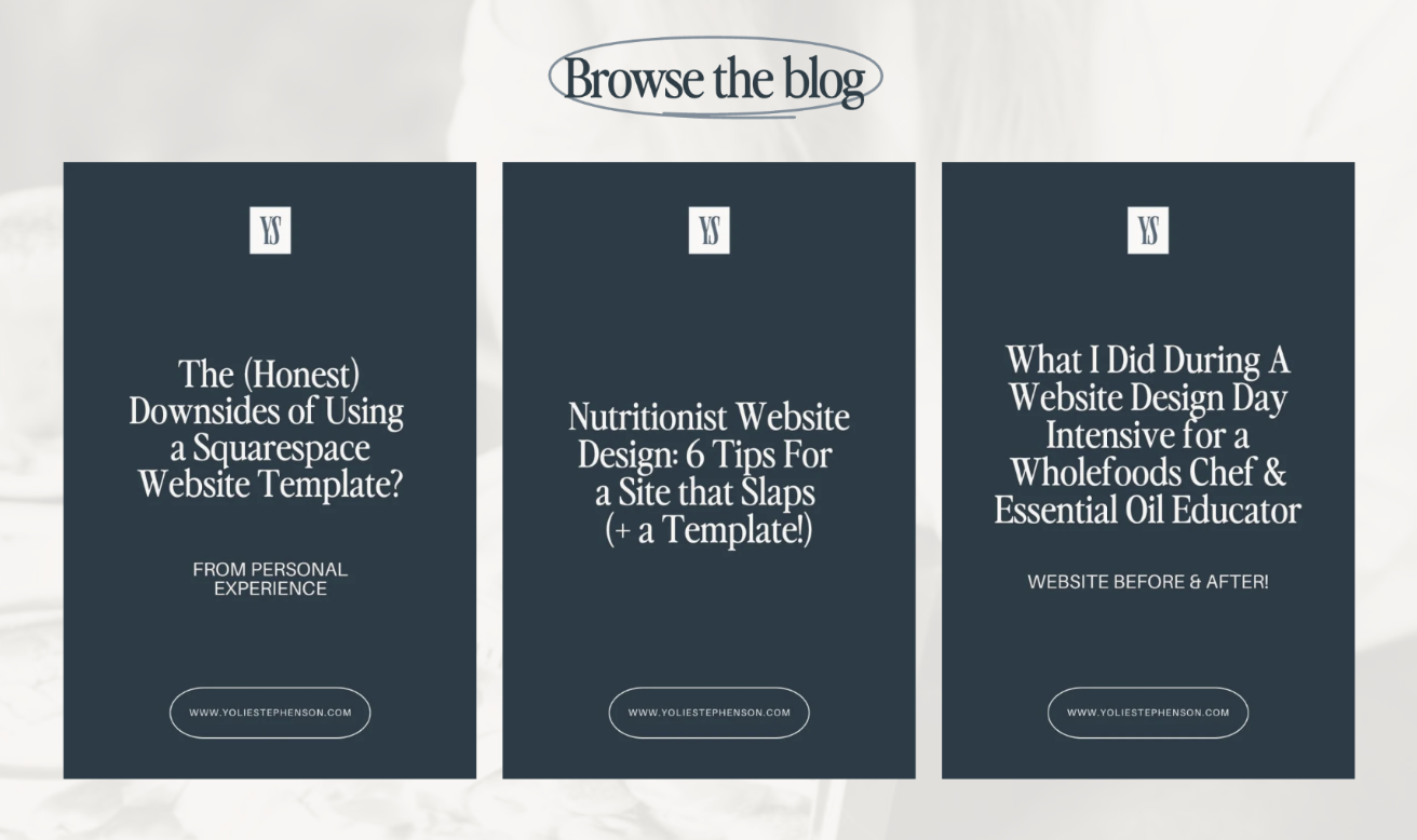
BONUS: Featured blog posts section
If you blog, you can highlight a few key posts. Include a button for them to click to read. These should be strategically chosen to help move people from curious browsers to confident buyers! I chose these because they show examples of my work and what we achieved in a day-intensive (people often wonder what’s possible), they share information about what a good website looks like (and position me as an authority), and the first one is somewhat scroll-stopping and controversial since I sell website templates myself! (In fact, the complaints I had about using them are the reasons I made my own set!)
TL;DR - How to Build a Website that brings clients into your Health and Wellness Practice
Tick off these items before launch, so your site converts from day DOT.
Strong hero section (headline, subheadline, testimonial or trust-builder, CTA & lead magnet) and succinct follow-up homepage sections.
Service pages focused on outcome-and-benefit-driven copy — and clearly explained pricing, process and inclusions
About page that makes people feel safe to take the next step, and identify you as the practitioner for them
Clear CTAs everywhereeee
Booking platform embedded into your website (online scheduling) & streamlined booking process
Testimonials and trust builders strategically placed throughout your site in key locations (around CTAs, above the fold)
FAQs on Services page near the booking section in an accordion drop-down - answers without clutter!
Mobile UX test—do the tap test to check everything is working well on mobile!
Strategic blogging to bring people to your site & move people from curious browser to big on trust and confident buyer
When you’re ready to take the next step, I’m here to help you create a website that truly reflects the care you bring to your work 💛
If you want hands-on help, I can take your website (and copy) from concept to launch so you can start booking clients from day one — or you can start with the Pippa Squarespace template for nutritionists, or the Laila Squarespace Website Template for Health Coaches and Counsellors.
Or if you’re a wellness practitioner with an existing site, I can optimise it during a Day Intensive. You may need more than one day to tackle everything, depending on where we’re starting and where you’re aiming. Feel free to book a Clarity Call to talk it through with me.